 Paywall and design system
Optimising the onboarding journey, from first open to paid
Guests were asked to register and pay before they had seen anything. I optimised the onboarding journey around value first.
- RoleSenior Manager - Product Design
- TimelineSep 2020 to Jul 2022
- PlatformsAndroidiOSConnected TVWeb
Scope
- Onboarding and subscription design, end to end
- The design system, on one token set
- The nudge strategy
- The plans and payment flow
- PProduct
- GGrowth
- TThe four platform engineering teams
Why it mattered
Subscriptions were becoming the business model, and big content launches brought the traffic the old funnel was losing.
The problem
Guests dropped before reaching content, and hard paywalls fired before anyone saw value.
Context
The company, the people, the goal
ZEE5 is one of India's largest streaming services, with 100M+ monthly users on Android, iOS, connected TV and web. Subscriptions were becoming the business model just as office returns, reopening cinemas and new RBI auto-debit rules squeezed sign-ups and renewals.
Who it was for
- Guest viewers
They opened the app to watch something now, and were asked for a language, a date of birth and a plan first.
- Engaged non-subscribers
Already watching non-premium shows, they needed to see what premium adds, not the same popup again.
- Lapsed subscribers
Many lost premium to a failed auto-debit, and came back to be treated as brand new users.
What success meant
- Business goal
Turn guest sessions into viewers and viewers into subscribers, in time for the big content launches.
- User goal
See the value of the content before being asked to register or pay.
Research
What we did to learn, and what we learned
- Funnel analysis
10.1M guest sessions in Mixpanel and Firebase, traced from display language through the intro, registration and the first watch.
- User interviews
30+ in-depth interviews across onboarding and subscription, in Tier 1 and 2 cities, on habits, competitors and what makes people pay.
- Stakeholder interviews
9 stakeholders across product, business, content and marketing, on why subscriptions were falling.
- Usability testing
The new registration and home screens tested with viewers, including unmoderated Maze tests with heatmaps.
- Benchmarks and reviews
Onboarding and plans on Hotstar, Netflix, Discovery+, MX Player and JioCinema, plus Play Store reviews about login and subscription.
I know ZEE5 has shows I want to watch. But every time I open the app, the Buy Plan button makes me feel like I'm not welcome unless I pay.
- 01
Guests left before they saw a single show
How we knowThe funnel: 30% left at the first screen, 31% at display language and 47% at the date of birth field.
What it changedContent first: language in one step, then watching, with sign-up as a short sheet over the content.
- 02
Hard paywalls taught people to dismiss every prompt
How we knowInterviews and tests showed people judge whether to pay by watching non-premium content first.
What it changedSoft nudges matched to what people are watching, escalating gently before any hard paywall.
- 03
A phone number and OTP beat passwords and social login
How we knowInterviews: OTP felt instant and suits shared accounts, Facebook felt like a privacy risk, and the password field lost more people after date of birth.
What it changedRegistration asks for a phone number, verified by OTP auto-read or in one tap, with no password and no date of birth.
- 04
New viewers need proof; returning ones need less friction
How we knowThe same interviews, and lapsed subscribers who were shown the new-user journey after a failed auto-debit.
What it changedSeparate plans pages for new and returning users, chosen by what someone does, not by demographics.
Principles
The rules every screen followed
- 1
Value before the ask
No registration or payment prompt until the viewer has seen what they would get.
- 2
Intent over segments
Read why someone came from what they watch: a third trailer says more than an account's age.
- 3
Decide once, build four times
A journey change is decided once on the token set, and each platform team builds it.
Process
- 01
Read the funnel
Mapped the guest journey from language to registration to subscription.
- 02
Talk to viewers
Research on why people did or didn't pay.
- 03
Optimise the journey
Fixed the path from first open to first watch before polishing screens.
- 04
Ship on one system
Every screen on one token set.
Key decisions
Decision 01of 04
Content first, sign-up later
Guests dropped in the first screens. Language now takes one step, and sign-up is a short sheet over the content.
- 1Display languageFolded in
- 2Content language
- 3Intro, four choicesSimplified
- 4Full-page sign-upReplaced
- ContentYou are watching
- 1Content language
- 2Intro, one clear choice
- Browse and watchYou are watching
- 4Short sign-up sheetAfter you watch

Decision 02of 04
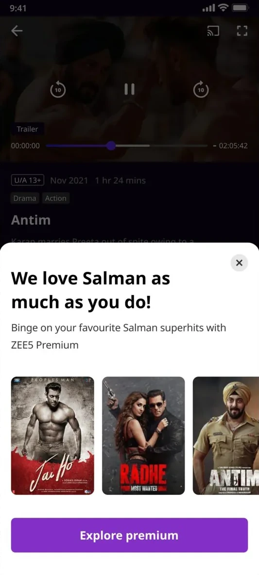
Soft nudges before hard paywalls
Paywalls fired before people saw value. Nudges now match what they're watching and escalate gently.











Decision 03of 04
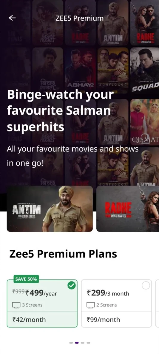
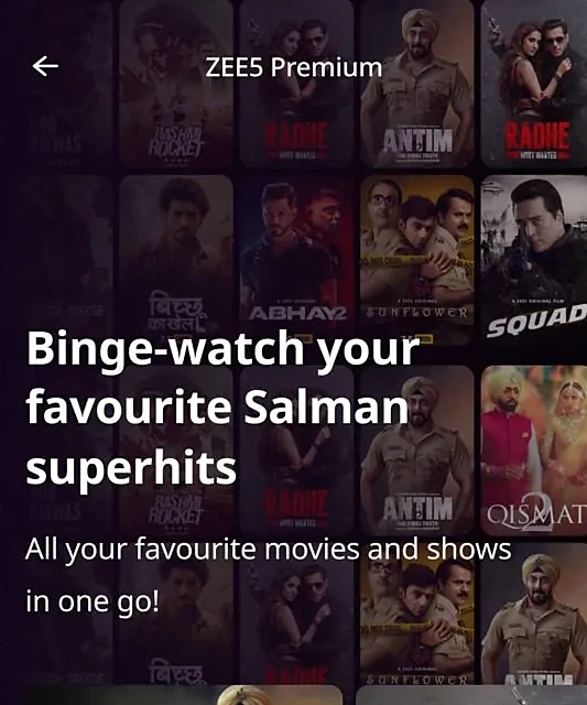
Plans for new and returning users
One cluttered plans page treated every visitor the same. Now new and returning users each get their own page.




Decision 04of 04
One token set, four platforms
Android, iOS, connected TV and web had drifted into four products. One token set now drives all four.






The journey after
End to end, as it shipped
- 1Open the app
Content languages in one step, with display language folded in.
- 2Intro, one clear choice
Premium and non-premium titles side by side, with one clear way to start watching.
- 3Browse and watch
Guests watch non-premium content straight away, with no sign-up.
- 4Short sign-up sheet
After some viewing, a sheet over the content asks for a phone number, verified by OTP or in one tap.
- 5A nudge that fits
Soft prompts tied to the moment: after a trailer, in an ad break, at a premium title.
- 6Plans for why you came
New viewers see what premium unlocks; returning and lapsed viewers see familiar shows and the price first.
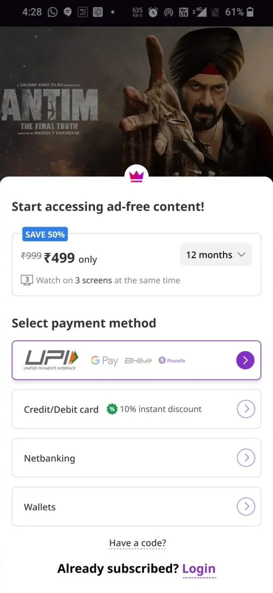
- 7Pay one decision at a time
UPI, card, netbanking or wallet, built on the same token set on every platform.
Edge cases
Designed for the messy moments too
- Phone number errors
Empty, incomplete, already registered and missing fields each have their own message. Only the wrong field highlights; the rest keep what was typed.
- OTP not read
The code is read automatically, with manual entry and a resend timer as the fallback.
- Viewer skips sign-up
The sheet can be skipped at first and becomes required after a set number of videos. Guest details map to the device, so nothing is lost.
- Premium title, guest viewer
The show page plays the trailer and says plainly that the full movie needs a plan, so nobody presses Play and feels tricked.
- Lapsed after a failed auto-debit
Recognised as a returning viewer: familiar shows, pricing up front and a short way back in.
- Keeps dismissing nudges
One last offer for people who have turned down every soft nudge, then the app stops pushing and lets them watch.
Trade-offs
What we said no to
Not this
Discounts as the default lever
Instead
Value first, then a gentle nudge.
Not this
Demographic segments
Instead
We read intent instead.
Outcome
The paywall shipped the same way on Android, iOS, connected TV and web.
People met value before the paywall, on every screen size.
- 2.4xSubscription growth during major content launches
- 87 ptNPS lift across the journey
- 100M+Monthly users on the new journey
- 4Platforms on one token set: Android, iOS, connected TV and web
- ShippedThe four platform teams kept shipping on the one token set after the paywall work
What outlived the project
The four platform teams kept shipping on the one token set after the paywall work.
Reflection
Looking back
What I learned
- Data ends debates. When stakeholders wanted to keep the date of birth field, the drop-off chart settled it in one meeting.
- Copy is a conversion surface. Plain labels and a short note on why a field is asked moved people more than layout changes did.
- Real launches are the real test. The journey was proven during the Radhe and Friends: The Reunion launches, not only in A/B tests.
What I would do next
- Judge each nudge by how often it is dismissed, not only by clicks, so the soft-before-hard ladder can tune itself.
- Treat a failed auto-debit as its own journey from day one, with a win-back path before the viewer notices premium is gone.
 One sign-in for two care programs