 Pulse design system
Pulse, from concept to shipped React in 3 weeks
Tap Health had screens but no system. I built Pulse with Claude and Figma MCP, and took it to shipped React in 3 weeks.
- RolePrincipal Product Designer & Design Engineer, contract
- Built in3 weeks
- StackFigma variables, Claude, Figma MCP, React
Scope
- Pulse, concept to shipped React
- The Claude and Figma MCP pipeline
- How engineering consumes tokens and components
- EEngineering
- TThe 3 designers I mentored
Why it mattered
More products were coming on the same foundations, including the clinician dashboard. Without a system, every new screen meant new one-off components.
The problem
Every screen meant new one-off components, and hardcoded colours made theming impossible.
Context
The company, the people, the goal
Tap Health builds a B2B healthcare platform for diabetes and GLP-1 care. WeightEasy, its GLP-1 app, had screens but no system, and nutrition, AI coaching, community and the clinician dashboard were all coming on the same foundations.
Who it was for
- Product designers
The four of us on the design team needed one answer for every colour, gap and state, so reviews were about the product, not pixels.
- Engineers
They needed tokens and components with the same names in Figma and in code, so nothing had to be asked or guessed.
- Claude, through Figma MCP
It reads the file's structure to write code, so it needs names that say what things are for and states that are described, not 'Variant 1'.
What success meant
- Business goal
Ship the next modules and the clinician dashboard on one foundation, without new one-off components.
- User goal
Find every answer in the system, without asking design.
Research
What we did to learn, and what we learned
- Design audit
Every WeightEasy screen and the code behind it: 23 different blues, colours hardcoded in code and no shared component definitions.
- Team interviews
2 developers and the PM, on where handoff broke: which blue, which radius for cards, what happens when a button is pressed.
- Health system benchmark
Carbon Health, One Medical and Headspace, checked for how they handle medication cycles and emotional moments. None did.
- AI workflow test
Claude with Figma MCP run on the existing files to see what it could read. Ad-hoc names and unnamed variants produced wrong code.
- 01
Twenty-three blues, none of them chosen
How we knowThe audit found every designer had picked a blue that looked right, and the code hardcoded each one, so a dark theme was impossible.
What it changedThe token layer came first: primitives, then semantic tokens named by job, then components on top.
- 02
Unstructured files produce wrong code
How we knowThe AI workflow test: generated components were unusable until names, properties and descriptions followed a pattern.
What it changedEvery component got plain names, semantic property names and a description, with Figma properties shaped like React props.
- 03
Handoff questions are about states nobody drew
How we knowIn the interviews, the questions were pressed, disabled and loading states, and values no one had written down.
What it changedStates became component properties, so they arrive with the component, and each pattern ships with its rule and reason.
- 04
A health app needs emotional registers, not only light and dark
How we knowNo benchmarked system was built for the dose cycle, and WeightEasy has goals reached, missed doses and side-effect days.
What it changedThe semantic layer carries celebration, caution and comfort without multiplying the tokens.
Principles
The rules every screen followed
- 1
Name for meaning
A token says what it is for, and keeps the same name in Figma and in code.
- 2
Figma shaped like code
Component properties match React props, so translation can be automated and reviewed line by line.
- 3
Rule plus reason
Every pattern ships with its rule and why it exists, so it holds when its designer is not in the room.
The documentation
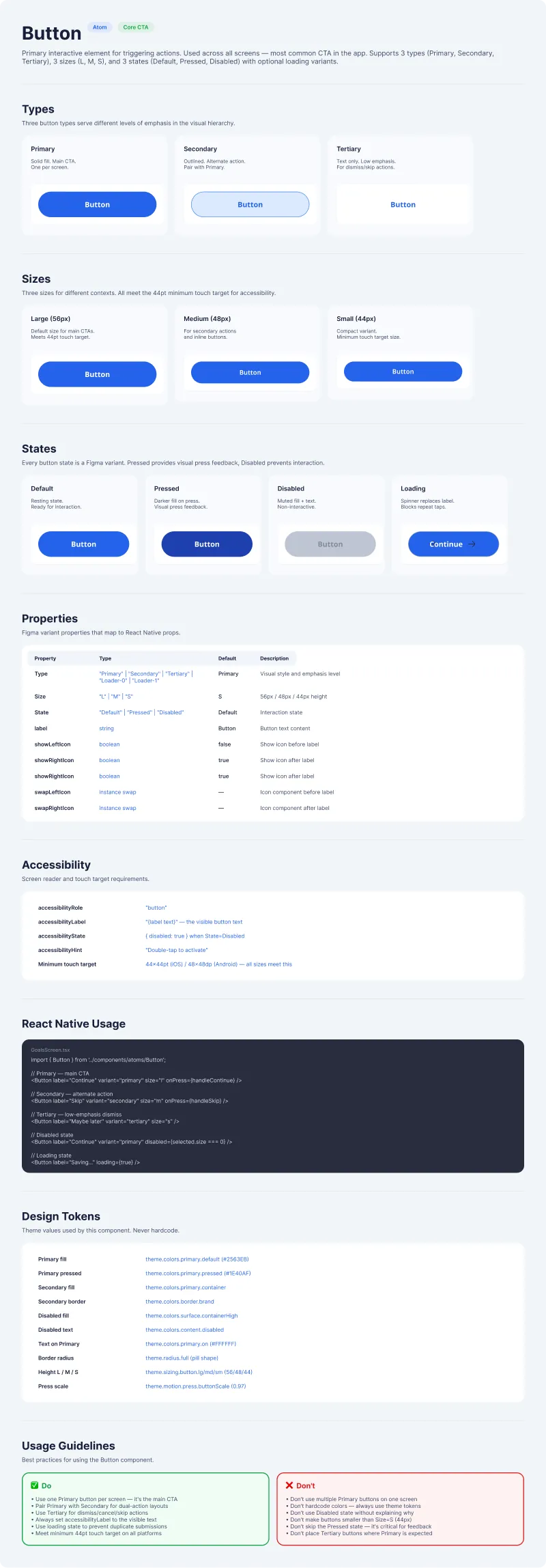
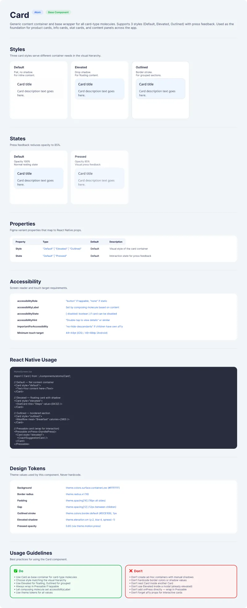
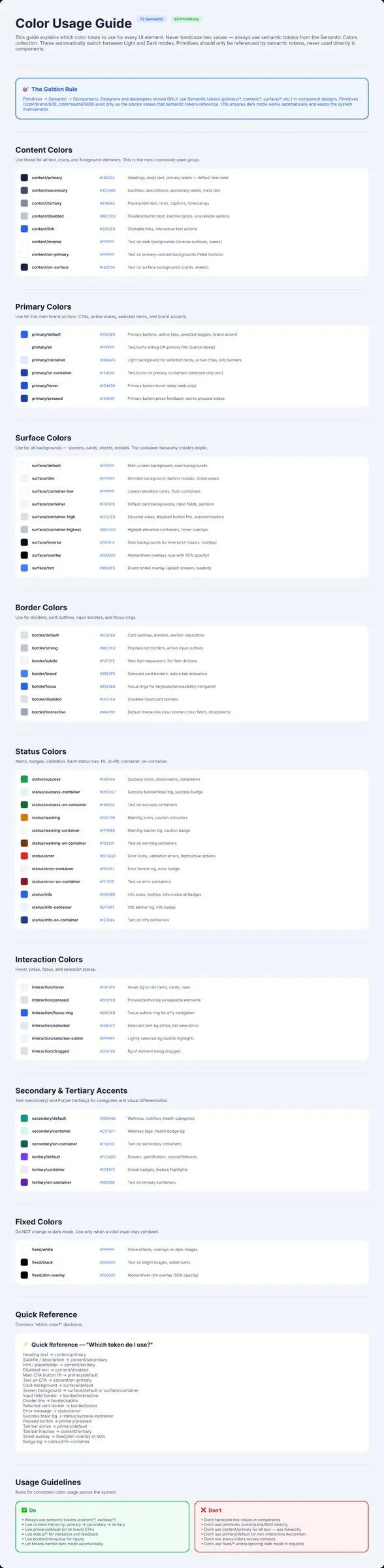
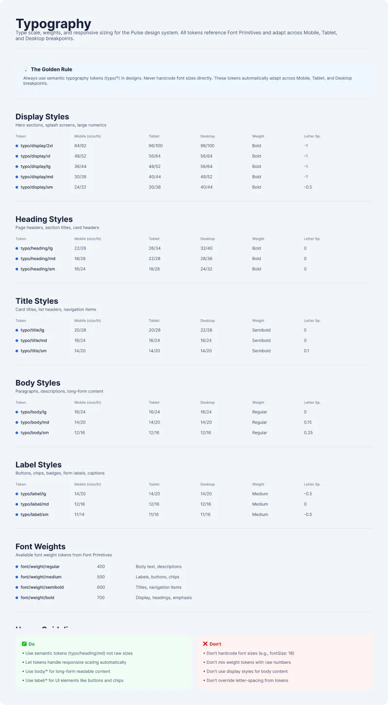
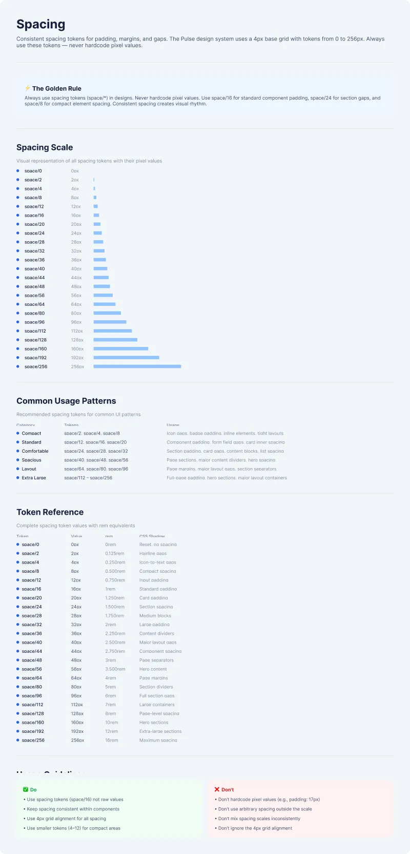
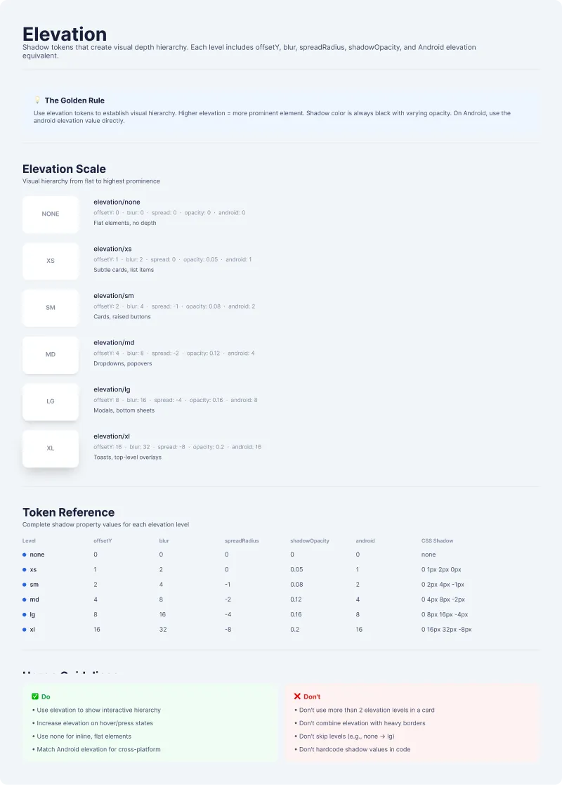
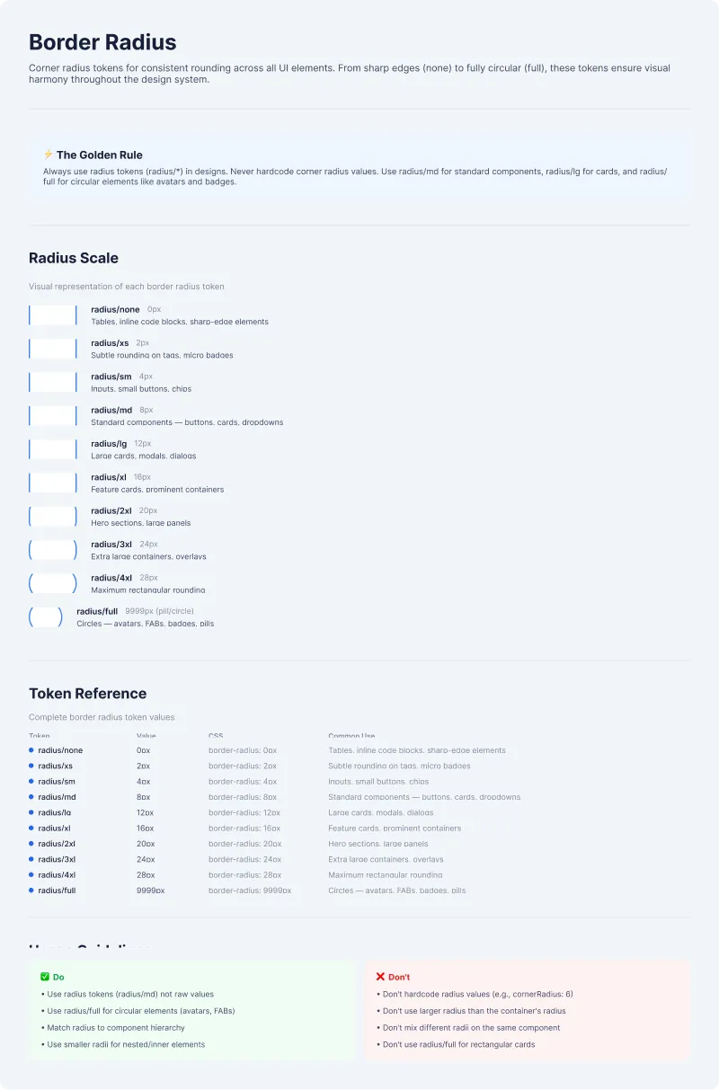
Every component, with its rule and its reason
Open any page and scroll it end to end. This is what engineering built from, with no handoff queue.
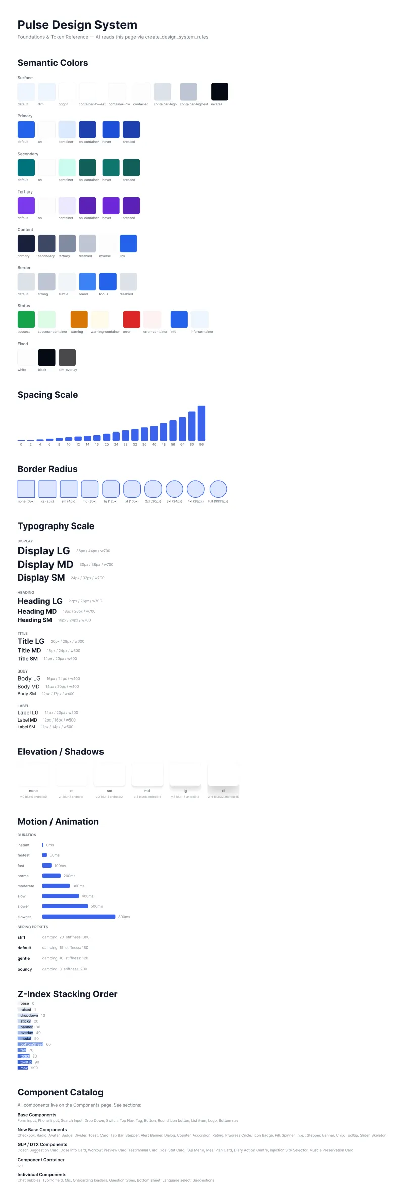
Process
- 01
Audit what exists
Catalogued the colours, spacing and components in use.
- 02
Tokens first
Primitives, then semantic tokens, then components.
- 03
Structure for the AI
Plain names and descriptions Claude can read.
- 04
Document the why
Each pattern ships with its rule and reason.
Key decisions
Decision 01of 03
Tokens first, components second
Hardcoded colours made theming impossible. I built the token layer first, so light and dark switch from one set.
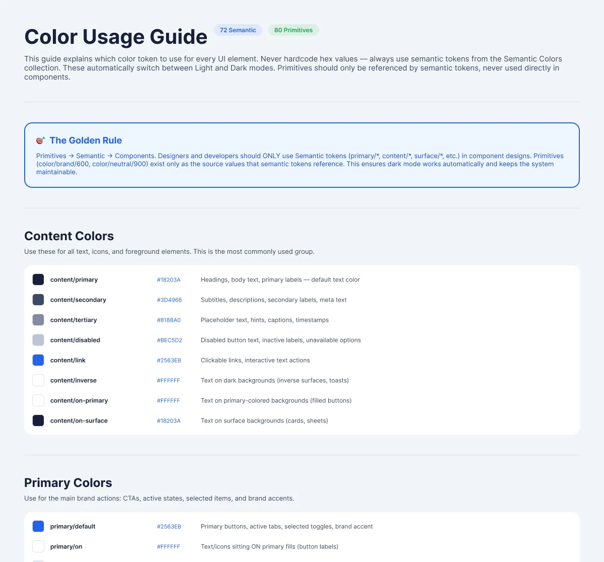 Primitives feed semantic tokensEach token names its job
Decision 02of 03
Built for an AI reader
Claude reads the Figma file through MCP to write the React. So every component carries plain names and a description.
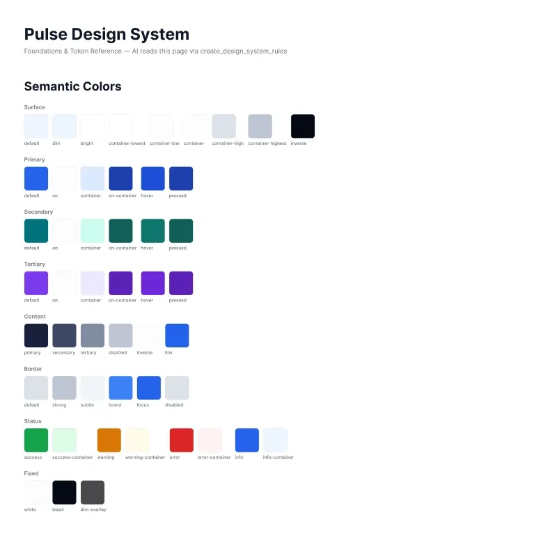 Written for Claude to readTokens named by role
Decision 03of 03
Rules that answer the question
A system people have to ask about is not a system. Each pattern ships with its rule and its reason.
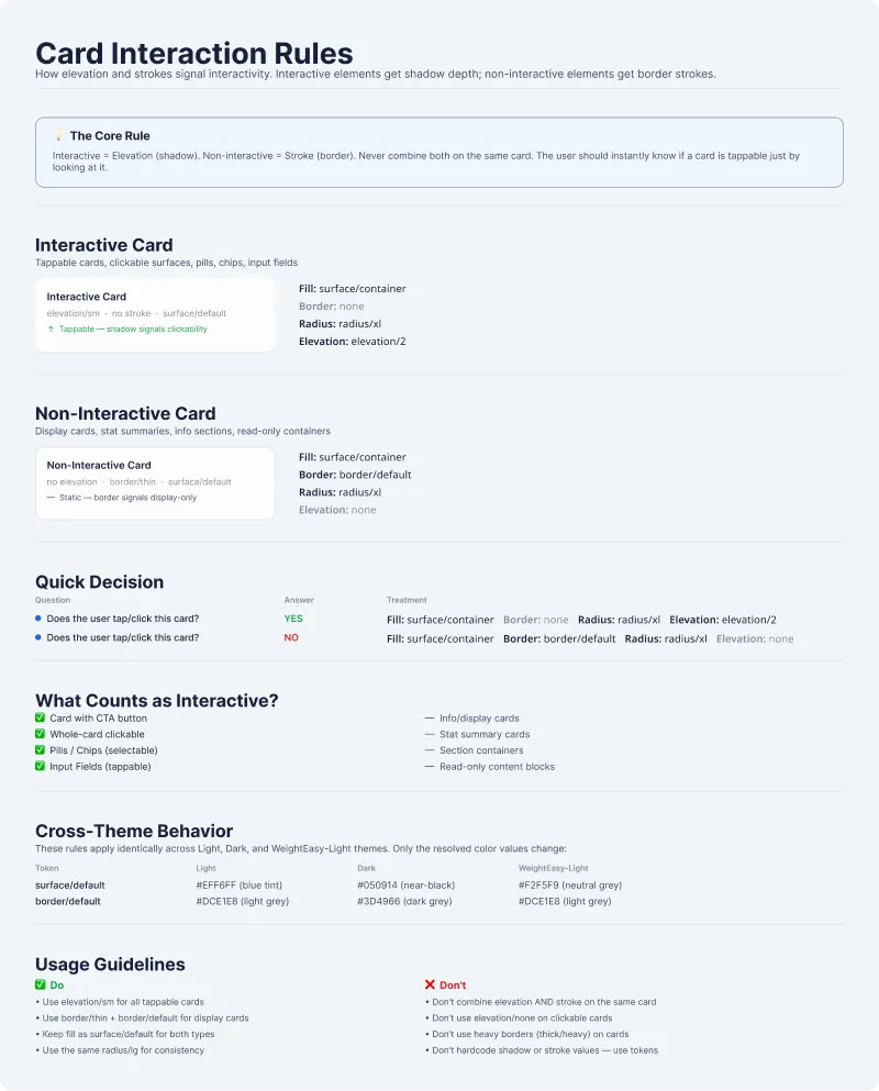 Shadow means tappableA yes or no checkSame rule in every theme
The journey after
End to end, as it shipped
- 1Decide in Figma variables
Foundations named for meaning: colour by job, type, spacing and elevation.
- 2Build components on tokens
Variants and states set up as properties shaped like React props, each with a plain name and description.
- 3Claude reads the file
Through Figma MCP, Claude reads which token a fill uses and which properties a component has.
- 4Code from structure
Claude writes React components that reference tokens, never raw values.
- 5Review as code
I review every generated component as code, property by property against Figma.
- 6Compose product screens
Designers and engineers assemble screens from Pulse. The clinician dashboard was built this way.
Edge cases
Designed for the messy moments too
- Pressed, disabled and loading
Built as properties in Figma and props in React, so every state arrives with the component instead of as a question.
- Tappable or static card
A shadow means a card can be tapped, a border means it can't, and the rule holds in every theme.
- Dark theme
Light and dark switch from one semantic token set through Figma variable modes, with no hardcoded colour left to break.
- A missed dose or a hard day
Semantic tokens carry emotional registers: celebration for a goal reached, caution for a missed dose, comfort for side-effect support.
- Keyboard, screen reader and small targets
A focus token draws visible focus rings, each component doc lists its accessibility role, label, state and hint, and the smallest button meets the iOS and Android touch minimum.
Trade-offs
What we said no to
Not this
A big component library on day one
Instead
The token layer came first, then components on top of it.
Not this
Handoff by redlines and walkthroughs
Instead
Each pattern ships with its rule and reason, so engineering builds without asking.
Outcome
Engineering shipped its first sprint with zero handoff queries.
Light and dark switch from one semantic token set, and the three designers I mentored work on the same system.
- 3 wkConcept to shipped React, through a Claude and Figma MCP pipeline
- 0Handoff queries in engineering's first sprint
- ShippedLight and dark themes from one semantic token set
- ShippedThe clinician dashboard, built on Pulse
- ShippedThe three designers I mentored onboarded onto the same system
What outlived the project
The clinician dashboard was built on Pulse.
Reflection
Looking back
What I learned
- Most of the time a design system takes is translation, not decisions. With the pipeline doing the translation, my weeks went into naming and review.
- Engineering asked whether V1 needed a full system. Making the case for tokens and docs up front paid back a few modules in, when new WeightEasy screens were assembled, not designed.
- AI readiness is a design decision. Naming and property structure decided whether the generated code worked.
What I would do next
- Keep counting handoff queries sprint by sprint, as the system's health metric.
- Add visual regression checks. With every value in tokens and code, drift from the spec becomes something a machine can catch.
A coach you can speak to, type to or show your plate