 DHFL AceApp
From paper forms to the app that carries the sale
Insurance agents sold on paper, over several visits. A focused first release grew into the app carrying 75% of sales.
- RoleProduct Designer, Gemini Solutions
- ClientDHFL
- Research30 agents and 20 customers
- AwardRedHat Digital Innovation Award 2018
Scope
- AceApp design, research to high fidelity
- Field research with 30 agents and 20 customers
- The MVP scope for field agents
- The information architecture, from card sorting
- DDHFL's agents
- SSales team
- GGemini's engineering team
Why it mattered
Sales depended on how fast an agent could close in the client's home, and paper added visits and errors to every sale.
The problem
Agents sold on paper in clients' homes, and every form was another visit and another chance of error.
Context
The company, the people, the goal
DHFL Pramerica Life Insurance sold policies through field agents who met clients at home, and handled every form, letter and cheque by hand. Gemini Solutions built Smart Insure, known as AceApp, to take that direct to customer sale off paper.
Who it was for
- Field insurance agents
They carry the forms, explain the policy, collect documents and payments, and track renewals and commissions themselves.
- Customers
Working professionals aged 25 to 40 in tier-one cities, buying from an agent and waiting to hear what happened next.
- DHFL operations
They received paper proposals and keyed them in, so every mistake on paper became a delay in the back office.
What success meant
- Business goal
Move the direct to customer sale onto one app and cut the manual handling of paper.
- User goal
Close the sale in the client's home in one sitting, then know where the proposal stands.
Research
What we did to learn, and what we learned
- Agent interviews with observation
Watched 30 field agents perform real tasks to test our assumptions and find where the sale broke.
- Customer survey
20 customers aged 25 to 40, working professionals from tier-one cities, on buying through an agent.
- Secondary and competitive research
Industry trends and how direct and indirect competitors sell, including their financial needs analysis tools, pricing and task flows.
- Closed card sorting
Categories set by the client; I sorted the cards with the project manager and client, and the result set the information architecture.
- Usability testing
Grey wireframes of the full flow tested with agents before any high-fidelity screen.
- 01
Any friction in the room sends agents back to paper
How we knowObserving agents: the proposal has to move while the client is still engaged.
What it changedShort steps, autofill such as bank and branch from the IFSC code, help notes on fields, and only the fields that apply.
- 02
Documents, not forms, forced the extra visits
How we knowAgent interviews: documents were collected by hand, and errors surfaced weeks later in the back office.
What it changedDocument upload inside the proposal with OCR validation, so problems are caught during the meeting.
- 03
Agents could not see their own business
How we knowInterviews: renewals, payment collection and commissions were tracked by hand, with no status after submission.
What it changedA dashboard with monthly sales, recent proposals, commissions, pending applications and proposal tracking.
- 04
Worry starts after the client signs
How we knowSurvey and interviews: customers asked for updates the agent could not give.
What it changedSubmission ends with an application number and a tracking link, and post-sales covers discrepancy resolution.
Principles
The rules every screen followed
- 1
Built for the living room
A tablet the agent uses beside the client: big targets, visual pickers, as little typing as possible.
- 2
The app catches errors, not the back office
Validation at entry, and no submission until the required details are there.
- 3
Show agents their own numbers
Sales, commissions and every proposal's status, one tap from the dashboard.
Process
- 01
Go to the field
Research with 30 agents and 20 customers.
- 02
Sort it with agents
Card sorting shaped the structure.
- 03
Map the sale
Pre-sales, proposal and post-sales, before screens.
- 04
Ship an MVP
A focused first release for field agents.
Key decisions
Decision 01of 03
Map the whole sale first
Paper hid how long a sale really took. I mapped it from needs to tracking before drawing a screen.
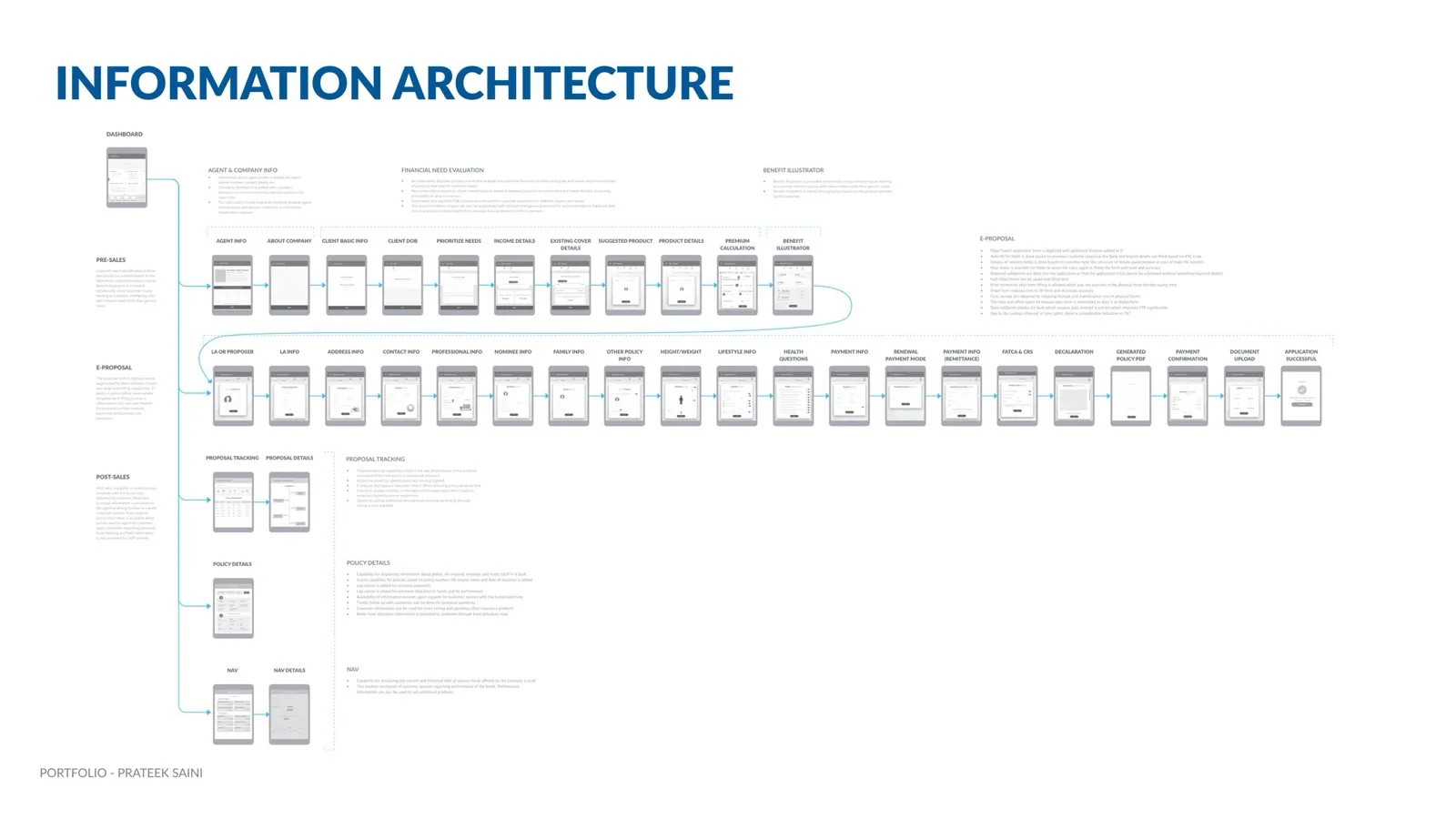 Pre-sales: needs to productPost-sales: tracking and policyEnds in a submitted application
Decision 02of 03
One sitting, start to submitted
Agents close while the client is in the room. The proposal runs in short steps that end in a submitted application.
Every task one tap awayProducts side by sideHeight and weight, no typingSubmitted, with trackingDecision 03of 03
A focused first release
We tested the flow with agents in grey wireframes first. Then a focused MVP for field agents shipped and grew from there.
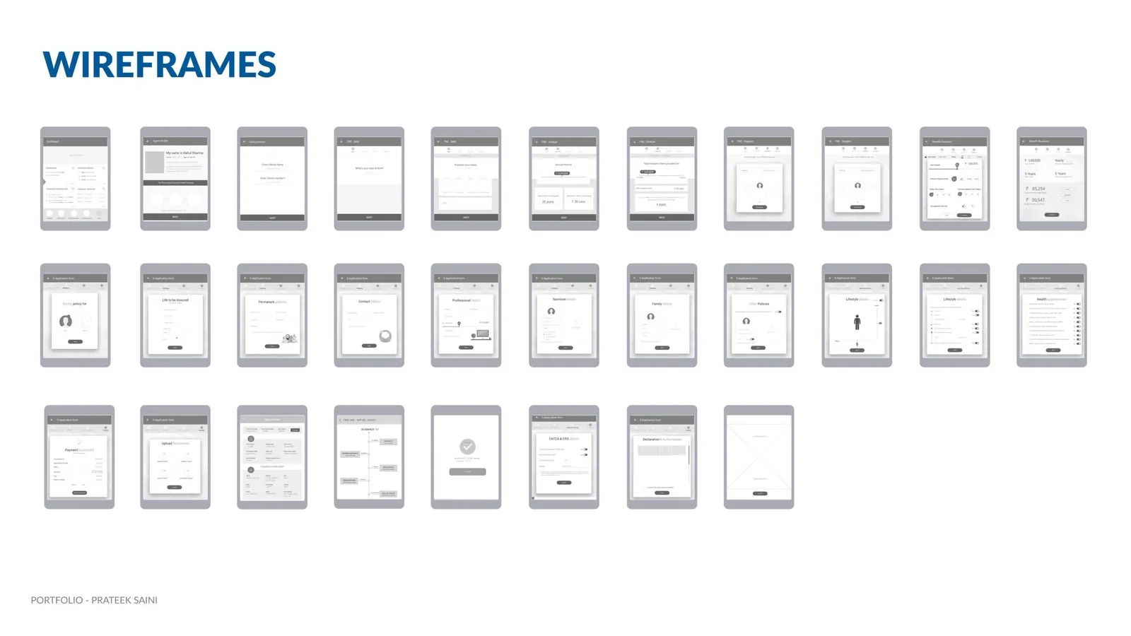 Proposal tracking timelineThe flow, tested in grey
The journey after
End to end, as it shipped
- 1Sign in
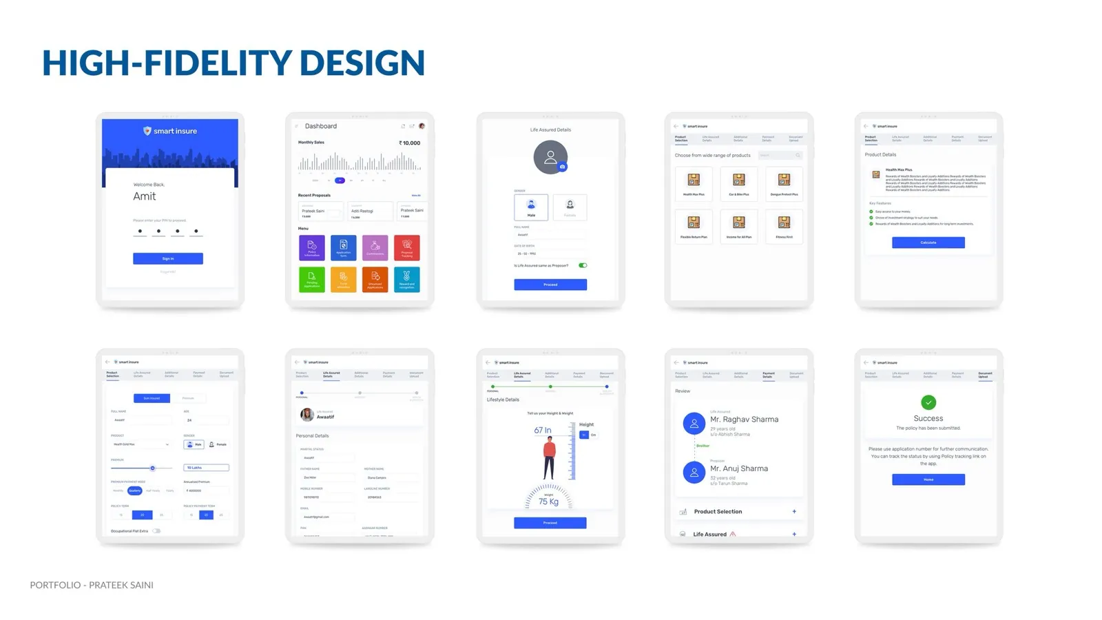
A PIN, then a dashboard with monthly sales, recent proposals and every task.
- 2Understand the need
Agent and company introduction, client basics, priorities, income and existing cover.
- 3Pick the product
A suggested product, its details, the premium calculation and a benefit illustration.
- 4Fill the proposal
Life assured and proposer, family and nominee, height and weight on a visual picker, lifestyle and health questions.
- 5Pay and declare
Payment and renewal mode, FATCA and CRS, the declaration and a generated policy PDF.
- 6Upload and submit
Documents checked by OCR, then a submitted application with a number to track.
- 7After the sale
Proposal tracking, policy details and fund NAVs, all in the same app.
Edge cases
Designed for the messy moments too
- Half-filled proposal
Saved, so the agent can finish it later instead of starting again.
- Required details missing
The application cannot be submitted until they are there, so it never bounces back weeks later.
- Mistake after filling
The agent can correct any field after the form is filled, which paper never allowed.
- Fields that do not apply
Hidden by customer type, for example the female questionnaire is left out for a male life assured.
- Proposer is the life assured
One toggle reuses the details instead of asking for them twice.
- Discrepancy after submission
Shown in proposal tracking and resolved from post-sales, not by a phone call.
Trade-offs
What we said no to
Not this
A digital copy of the paper form
Instead
We redesigned the whole sale, from needs to a submitted application.
Not this
Every feature in the first release
Instead
A focused MVP for field agents shipped first, and the app grew from there.
Outcome
A focused first release for field agents became the app carrying most of DHFL's sales.
RedHat Digital Innovation Award 2018.
- 75%of DHFL's sales on the app
- 30agents in the field research
- 20customers in the survey
- AwardRedHat Digital Innovation Award 2018
What I don't claim. The 75% is DHFL's share of sales on the app, the product's result across the business.
Reflection
Looking back
What I learned
- Watching agents in clients' homes showed what no brief did. A desk-designed app would have been a different, worse product.
- Digitise the sale, not the form. Copying the paper proposal onto a screen would have kept every visit and every error.
- Visibility won the agents. Seeing their sales, commissions and proposal status mattered as much as any form feature.
What I would do next
- Measure where agents still fall back to paper, step by step, and fix those steps first.
- Give customers proposal status directly, so the agent is not the only way to find out.
 Making a reopened cinema feel safe to book