 Cinema Revival
Making a reopened cinema feel safe to book
Before cinemas reopened, I designed contactless, safety-first booking. It launched after I left.
- RoleAssistant Manager, Product Design
- DesignedBefore Aug 2020
- LaunchedAfter I left
- PlatformsAndroidiOSMobile webDesktop
Scope
- The cinema details page
- Safety touchpoints across booking, home screen to ticket
- Where safety shows up in the booking path
- PProduct
- EEngineering
- CContent
- TThe marketing team behind the campaign
Why it mattered
Cinemas were reopening during a pandemic, and people needed to trust a hall before they bought a seat.
The problem
People wanted proof a cinema was safe before buying a seat, and booking showed only showtimes and prices.
Context
The company, the people, the goal
BookMyShow is where India books movie and live event tickets. In 2020 the pandemic had shut cinemas, and the product had to be ready for the day they reopened under capacity limits, with an audience that wanted to come back but did not trust the hall.
Who it was for
- Returning moviegoers
They want proof a cinema is safe, with photos, at the moment they choose it, without leaving booking.
- Cinema partners
They send their own photos, safety measures and facilities, and some send far more than others.
- BookMyShow marketing
They ran #CinemaIsBack and needed the product to back up what the campaign promised.
What success meant
- Business goal
Turn reopening intent into bookings by making BookMyShow the place people check a cinema is safe.
- User goal
See a cinema's safety measures, facilities and real photos before buying a seat.
Research
What we did to learn, and what we learned
- Competitive benchmarking
How AMC Theatres, Cineworld and Indian platforms showed cinema safety, from badges to venue photo galleries.
- Venue data audit
What each cinema partner could send: photos, safety measures, facilities and address, and where the gaps were.
- Interaction patterns with engineering
Bottom sheets, accordions, a popup, a redirect to a details page and a gallery inside an accordion, judged on feasibility, experience and the deadline.
- Journey mapping
Every touchpoint from the home screen to the confirmation email, to find where reassurance dropped away.
- Design review against builds
Android builds checked against the designs for spacing, icon sizes, type, popup heights and transitions.
- 01
Rivals kept safety on a separate page
How we knowBenchmarking: chains abroad had safety pages per location, but none showed it while you chose a cinema.
What it changedSafety tags and safety filters sit in the showtime list itself.
- 02
Venue data would always be partial
How we knowThe data audit: some cinemas had photos and every measure, others had almost nothing.
What it changedEvery combination of missing photos, measures and facilities was designed, so a gap never looks like hiding something.
- 03
A claim needs a photo behind it
How we knowBenchmarking: the strongest examples backed their claims with real venue galleries.
What it changedA gallery filed by measure, such as safety, halls, food and contactless ticketing, carrying the My Safety First badge.
- 04
Reassurance fades between choosing and arriving
How we knowJourney mapping: after the cinema page, nothing reminded people what to expect at the door.
What it changedReminders at seat selection, on the M-ticket, in the email and on a safety instructions page.
Principles
The rules every screen followed
- 1
Inform, then reassure
Facts about the venue at the decision, then reminders at every step after it.
- 2
A gap is normal
Missing data makes the page simpler, never broken or suspicious.
- 3
Never leave the booking path
Cinema details open from the list and close back to the same showtimes.
Process
- 01
Find where trust breaks
Choosing a cinema was the anxious step.
- 02
Safety in the list
Tags beside showtimes, details one tap away.
- 03
One page per cinema
Photos, measures and facilities everywhere.
- 04
Carry it to the door
Seat reminders and a contactless ticket.
Key decisions
Decision 01of 03
Safety where you pick a cinema
Anxiety peaked at the cinema list, not on a campaign page. Each cinema shows its safety measures beside its showtimes.
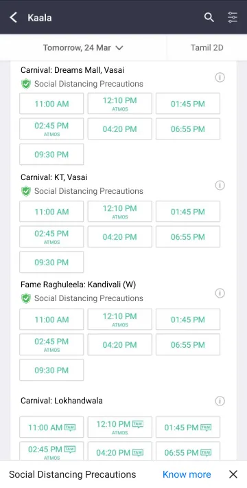 A safety tag per cinemaDetails without leavingEvery measure, namedReal photos of the hall
Decision 02of 03
One cinema page, every screen
The same cinema page runs on app, mobile web and desktop. It holds up when a cinema sends only part of its data.
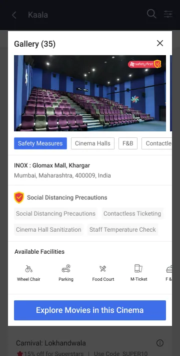
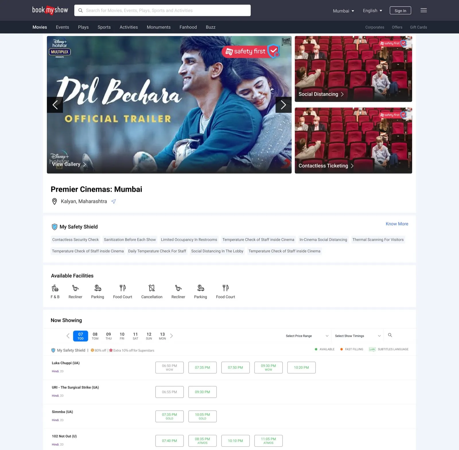 Every measure, listed by namePhotos filed by measureFacilities as icons
Decision 03of 03
Reassurance through to the door
Safety reminders follow people to seat selection and the ticket. Entry is contactless, by QR.
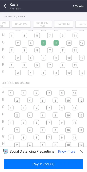
Every other seat blockedA reminder before you pay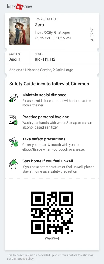 Guidelines on the ticketContactless entry by QR
The journey after
End to end, as it shipped
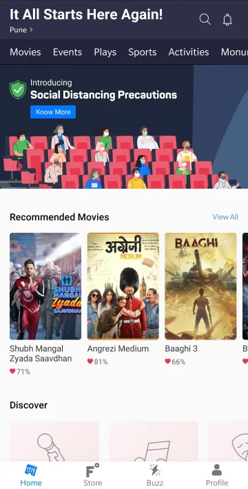
- 1Home
A safety banner is the entry point for people deciding whether to go back.
- 2Showtimes
Each cinema carries its safety tags, and the list can be filtered by measure.
- 3Cinema details
A sheet opens from the list with photos by measure, safety tags, facilities and directions.
- 4Full cinema page
For people who want more: every measure by name, the gallery and the facilities, on every platform.
- 5Seat selection
Distanced seats blocked, and a reminder of the guidelines before paying.
- 6Ticket and email
The M-ticket carries the guidelines and a QR code for contactless entry; the email repeats them with a link to the full instructions.
Edge cases
Designed for the messy moments too
- Cinema sends no photos
The gallery drops out and the page leads with measures and facilities, instead of an empty frame.
- Missing measures or facilities, alone or together
Each combination has its own layout, so the page shortens cleanly whatever arrives.
- Mobile web
Its own variants of the details sheet and page, not a stretched app layout.
- Error loading details
A designed error state, so a failed fetch never looks like a cinema with nothing to show.
- Distanced seating
Every other seat is blocked in the seat map, with a safety reminder before payment.
Trade-offs
What we said no to
Not this
A separate safety page
Instead
Safety sits inside booking, where people choose a cinema.
Not this
Waiting for every cinema to send full data
Instead
The page works with whatever each venue has.
Outcome
At the relaunch, after I had left, the product sold 2.6M tickets in week one.
Safety sat inside booking, from choosing a cinema to the ticket at the door.
- 2.6Mtickets in week one of the relaunch, the product's result after I left
- ShippedMy Safety First tags across booking at the relaunch
- ShippedOne cinema page on Android, iOS, mobile web and desktop
What outlived the project
The safety tags I designed shipped across booking at the relaunch.
What I don't claim. I designed this before I left in Aug 2020 and it launched later. The 2.6M tickets is the product's result, not a number I moved.
Reflection
Looking back
What I learned
- Trust is designed at the decision point. A banner can promise safety; a cinema page with real photos has to show it.
- When data comes from partners, design the gaps first. The full page was the easy part.
- Reassurance has to repeat. One page informs, but people needed reminding at the seat, the ticket and the door.
What I would do next
- I left before launch, so I never saw it in use. I would compare bookings for cinemas with full data against those with gaps.
- Use that comparison to show partners what sending photos and measures is worth, so the gaps close.
 From a clinical intake form to a coach that speaks your language